Tiled U.S. map with CSS grid
One of the most common news graphics is a map of the U.S. displaying some metric on a state-by-state basis — number of coronavirus infections, unemployment rate, percentage of residents with college degrees, number of golf courses per capita, etc. Often, the map is interactive. Click on a state and see some details about the metric in question.
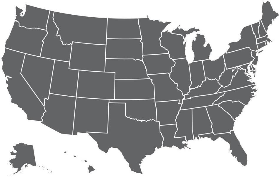
From a usability standpoint, the problem with this is — not to get too technical, but — some states are very big and some states are very small. And very small states are difficult to label and hard to click or tap.
Enter the tile map
Tile maps represent the states as some regular geometric shape of equal size, typically squares, but I’ve also seen hexagons. For our purposes here, I’m going to use squares, because they’re easy to build using nothing more than css.
Full disclosure: You can find better blog posts about the whys of tile maps. I’m mostly writing this to work out the kinks of including example code in a blog post. I built this site using Jekyll, hosted on GitHub pages, and a site theme built almost from scratch — I used minima as a starting point. Maybe someday I’ll do a full blog post about that experience, but for now, I’m keeping it simple.
But I digress. A square-tile map is simple to do using nothing more than CSS grid. I’ve used it in a couple of places, most recently on this page promoting the #DistanceDance movement on social media and this one tracking the status of states’ coronavirus restrictions. They both look like this, more or less.
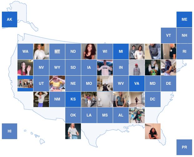
Each state is represented as a square tile, ordered to roughly appear where it would on a normal map. To help readers undersand what they’re looking at, I added a silhouette of a standard U.S. map behind the tiles as a visual hint that this is indeed a map.
Bulding the map
As I said, I built this map using nothing more than html and CSS. It’s a 12-by-9 grid with strategic spacing to roughly represent the shape of the continental U.S. The html looks something like this:
<div class="grid-container">
  <div id="AK" class="state"></div>
  <div id="ME" class="state"></div>
  <div id="VT" class="state"></div>
  <div id="NH" class="state"></div>
  <div id="WA" class="state"></div>
  <div id="ID" class="state"></div>
  ...
</div>
The container div uses CSS grid layout, like so:
.grid-container {
  display: grid;
  grid-gap: 1px;
  grid-template-columns: repeat(12, 1fr);
  grid-template-rows: repeat(9, 1fr);
}

.state {
  background-color: #cccccc;
}
I’m using postal codes for the states. Take note that they’re not in alphabetical order; they’re in the order I want them to appear on the map. From left to right, top to bottom, Alaska is the first state, and Maine is next because it’s the next state in the top row of the grid.
So far, this is what we have.
Not exactly what we wanted. We want square states, and it would be nice to make those postal codes a bit smaller and center them in the state. We can accomplish the former with a little pseudo element magic to set the aspect ratio to 1:1, and for the latter, flexbox will get us where we want to be.
.state {
  background-color: #cccccc;
  font-size: 13px;
  display: flex;
  align-items: center;
  justify-content: center;
}

.state:after {
  content: "";
  height: 0;
  padding-top: 100%;
  width: 1px;
}Better. Now to give it the general shape of the United States. The key to this is the grid-column-start property. Take a look at the square for “ME”, or Maine. As the second item in the grid container, it falls in the second column. But we want it positioned in the 12th column. As the name implies, setting the grid-column-start property to 12 on that element will push it to that column:
Moving Maine to the 12th column pushes Vermont to the first column in the next row, but we want it in the 11th row, so that’s the next target for grid-column-start. That pushes Washington to the first column in the next row; we want it in the second column. And so on and so on. Setting grid-column-start on the appropriate states forces them into the rough shape we want.
#ME {
  grid-column-start: 12;
}
#VT {
  grid-column-start: 11;
}
#WA,
#OR,
#CA {
  grid-column-start: 2;
}
#AZ {
  grid-column-start: 3;
}
#OK,
#TX {
  grid-column-start: 5;
}
#HI {
  grid-column-start: 1;
}
#FL {
  grid-column-start: 10;
}
#PR {
  grid-column-start: 12;
}Almost done. If you look at Puerto Rico on the #DistanceDance example above, it’s pushed down another row. As we can change which column a state appears in with grid-column-start, we can change the row with grid-row-start.
#PR {
  grid-column-start: 12;
  grid-row-start: 9;
}Finishing up
Everything that comes after this is standard web development stuff: adding click listeners, styling individual states to reflect data, etc. Of course, you could change the order of the states. If you search for “tile grid u.s. map” on Google, you’ll see many variations of this map with many different orders of states, paticularly in the northeast region of the map where states are small and don’t easily translate to a grid. I chose my order giving greater weight to a state’s neighbor to the east or west as opposed to north and south. You might think the reverse makes more sense.
That’s really about it. I hope you learned a little something. (Just as I learned how to include code examples in a blog post.) Happy coding.